
If you are engaged in assessing programs or services, you are likely interested in change – particularly in improvement. Improvement is a central tenet of assessment within the higher education context: We use assessment results to drive organizational or programmatic change – with the ultimate goal of improving outputs or outcomes. But how do we know if our changes have, in fact, improved our outcomes?
The most obvious answer is that we choose a point in time after making changes, and assess our outcomes again. Easy enough . . . maybe?
Looking at Pre and Post Aggregated Data
Consider the following example adapted from an online NHS Guide.
Suppose an admissions office is implementing a new customer relationship management system, with the desire to improve the satisfaction of applicants and their families. They measure the satisfaction during the application cycle one year, implement the new CRM system, and then measure again during the next cycle. The results look as follows:
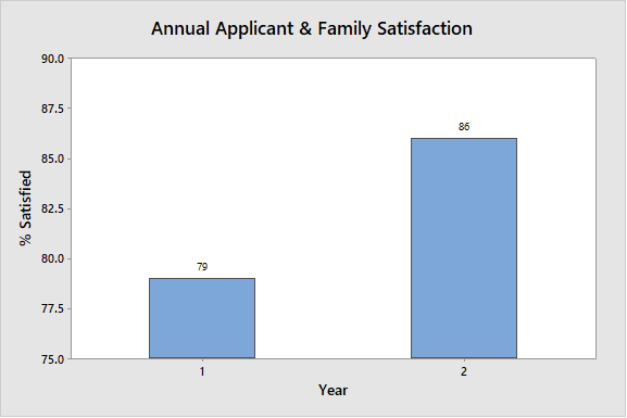
Viewing this graph, it would appear that there was a meaningful increase in satisfaction from year 1 to year 2. Our conclusion could easily be that the new CRM system has done its job, and that applicant and family satisfaction has increased as a result.
Adding Time-based Measurements
However, what happens when we disaggregate the annual data into time-ordered monthly satisfaction data? We then see something that looks very different:
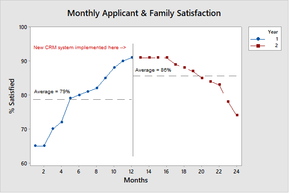
With this graph we can see that satisfaction was on the increase prior to the implementation of the CRM system and, after a brief plateau, has begun to decrease. What are our colleagues in admissions supposed to conclude now? Does the increase in the mean of annual satisfaction or the downward trend of monthly satisfaction tell the real story?
Part of the answer lies in understanding that we are trying to describe this ”process” through our own eyes. When we look at data over time, we often contextualize them in a framework that seems meaningful to us – one year over the next; a trend that we want to see go up or down, or specific targets chosen for a host of possible reasons. Instead we need to, in the words of Donald Wheeler (see resource below), listen to the “voice of the process.” We need to let the system tell us about its own performance so that we can ascertain when change has actually occurred.
In order to do this, we need to understand two types of variation that may be present in data that is plotted over time; common cause variation and special cause variation.
Common cause variation is variation that is inherent in the system or process. It is due to ordinary causes that affect the process all the time. This type of variation will also yield what is considered a stable process – the variation is predictable via statistical analysis. This type of variation is sometimes referred to as the ‘noise’ of the process/system.
Special cause variation is variation that is caused by irregular events that are not inherent in the process. This type of variation can result in an unstable process that is not predictable. This type of variation is sometimes referred to as a ‘signal’.
To try to understand when change has actually occurred within the process/system we need a way of separating the noise from the signals.
Using Control Charts
A specific tool that can do just this is a control chart. While initially developed and deployed in the context of process management, these charts can be used in many contexts to look for change. Control charts use time-ordered data to establish upper and lower control limits. These control limits are determined statistically and represent the line between data points that are the result of common cause variation and those that are result of special cause variation – boundaries between the system noise and a signal. Statistical calculations behind control charts revolve around understanding the average change between consecutive measures (called the average moving range) and the mean of the set of measures you are tracking (like monthly satisfaction measures in the example above). Below is a typical control chart showing a graph for both the individual values and the moving range:
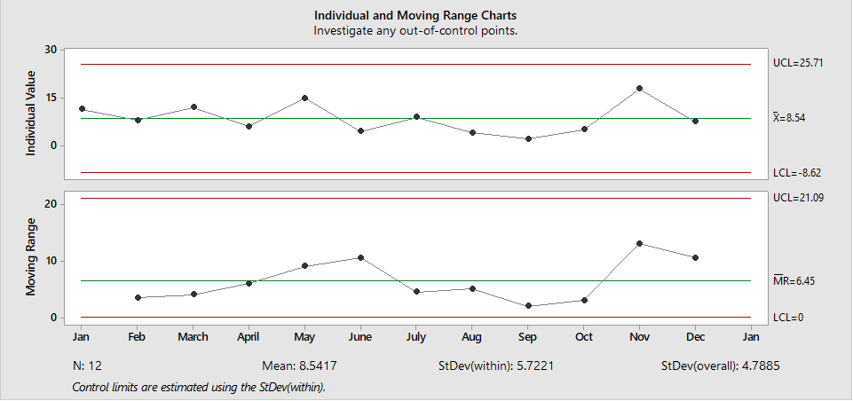
The red lines represent the lower and upper limits of the process. Generally speaking, data points within the range defined by these limits are the result of common cause variation (process noise), while data points outside of the bounds are the result of special cause variation (a signal of change). However, there are several additional patterns of data in a control chart that can point to special cause variation including; 8 or more points on one side of the mean, 6 or more points heading in one direction, and 2 out of 3 points near a control limit.
How does this relate back to our original question about recognizing improvement? When leveraging control charts in the context of assessment, we are looking for evidence of special cause variation; special cause variation that corresponds to the implementation of enhancements or changes. If we truly improve a “process” we will have succeeded in introducing special cause variation into the system.
There are limitations to the use of control charts: time ordered data must be available both before and after the intended organizational change; the service or program being assessed must be capable of yielding frequent and regular data; and the process/system must be stable.
Nevertheless, control charts present a powerful tool for analyzing the impact of programs and services, and can enhance your assessment toolbox.
Have you had successes or challenges assessing for improved outcomes? Are there programs on your campus that you think would lend themselves to analysis with control charts? We’d love to hear your comments below!
Resources
- For a quick primer on control charts see: https://qi.elft.nhs.uk/resource/control-charts/
For an in-depth and interesting exploration of variance and the use of control charts take a look at:- Wheeler, D. J. (2000). Understanding Variation the Key to Managing Chaos. Knoxville, TN: SPC Press.
- For an example of the use of control charts in assessing improvement see:
- Brown, C. M., Kahn, R. S., & Goyal, N. K. (2017). Timely and Appropriate Healthcare Access for Newborns: A Neighborhood-Based Improvement Science Approach. New Directions for Evaluation, Number 153 (Spring 2017), 35-50.
Daniel Doerr, University of Connecticut