This blog provides a summary of the data analysis and results from the 2022 open course that ran February – April 2022. Reporting this year resulted in 166 total pages (!) opening with a 5-page executive summary and followed by reports for the Welcome Survey/User Profile, Quiz Results, Assignment Rubric Results, and User Experience/End of Course Survey Results. The executive summary has hyperlinks to these respective reports and data disaggregation elements summarized. Since that’s a lot of reading, the post below gives the highlights!
Enrollment
This year, we saw 1047 participants enroll in the course, with 153 of them successfully completing the course. This 14.61% completion rate is just shy of the 15% completion rate from 2021 when the written assignments did not have a specific score required to earn the course badge. Seeing how close the scores were to last year helped ease my concern the graded assignments would limit our completers.
Welcome Survey/User Profile
Participants are largely hearing about the course from friends of colleagues, from SAAL, or through social media. They take the course because they enjoy learning about topics that interest them and hope to gain skills for a promotion or new career. While they have online experience from school or through other MOOC providers, course takers identify almost split as passive and active participants for this course and they anticipate spending 1-2 hours per week on the course.

Photo credit: Armin Rimoldi via Pexels
Course takers have 40% or less of their jobs dedicated to assessment and identify as intermediate or beginners with respect to their assessment competency. They hold all sorts of roles at institutions, primarily staff and managers/directors. They attend from all types of institutions, but the largest concentration are in public 4-year over 10,000 and private 4-year under 10,000. While we have course takers from all over the world, the vast majority are from North America and the vast majority of participants speak English as their native language.

Photo credit: fauxels via Pexels
Course participants typically have master's degrees, the next largest group has terminal degrees. The course welcomed all ages of participants, but the highest populated age groups were 25-34, 35-44, and 45-54. Course participants are mostly female and primarily identify as women. While many races and ethnicities are represented, the majority of participants identified as White.
Because course completers had a near identical demographic distribution/profile as the initial sample of survey respondents, the above narrative profile holds true for them, too.
Quiz Results
Overall, quiz results are very positive with respect to demonstrated student learning. The mode quiz scores were the max values (100% correct score) per respective quiz, so average quiz scores are shown here to offer a bit more variability with respect to student performance in each quiz. Even with the averages, each quiz average is 93% correct or higher.
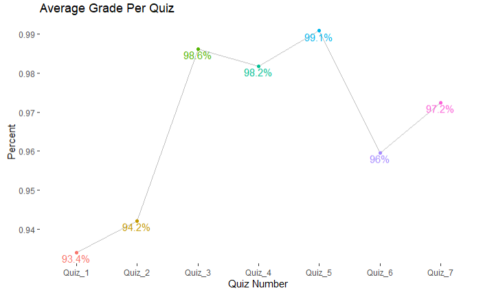
These average scores were slightly down compared to last year's data with two scores as the same, three lower than last year, and two higher than last year. Last year's details compared to this year's, respectively, include: 2021 Quiz 1 was higher with 97.5%, 2021 Quiz 2 higher with 96.6%, 2021 Quiz 3 was higher with 99.2%, 2021 Quiz 4 was the same, 2021 Quiz 5 was slightly lower with 99%, 2021 Quiz 6 was the same, and 2021 Quiz 7 was lower with 96.8%.
Data Disaggregation
Overall quiz results were disaggregated by completer demographics. As such, results are filtered from all course participants (1047) to those who completed the course (153). Then, the results are further filtered to remove course participants who did not consent to their data being used for reporting purposes, bringing the sample to 150. Finally, results per demographic question may vary in sample size due to consenting course completers who may not have answered specific demographic questions or taken the Welcome Survey at all (where demographic data is gathered) – a maximum possible sample size of 136 based on completers taking the Welcome Survey.

Photo credit: Mikael Blomkvist via Pexels
Across quiz scores and demographics, there are some interesting results when disaggregating data by demographic groups. Looking across a given demographic's scores (i.e., across all groups within a given demographic), the most participants with overall quiz scores of 95% or higher was viewing scores by geographic location (73%), followed by native English speakers and sex (both 71%), and education level (70%). The least participants with overall quiz scores of 95% or more was viewing by institutional type (61%), followed by role (63%) and online learner type (64%).
Assignment Results
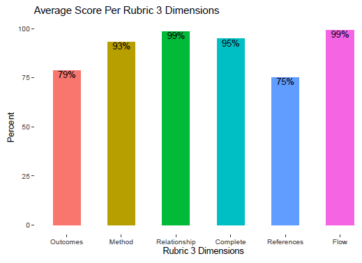
Overall, participants who completed the course did pretty well on assignments. Participants needed a score of 75% or better on each assignment to count toward earning the course badge. The mode score for the Module 3 assignment was 30 out of 30 overall, with the following mode scores per rubric dimensions: Outcomes 5/5, Method 5/5, Relationship 5/5, Complete 5/5, References 5/5, and Flow 5/5. More detail on descriptive stats are above. Last year, the mode score was 28 out of 30 and the mode score for the References dimension was 3/5.
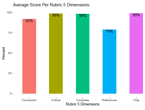
The mode score for the Module 5 assignment was 25 out of 25 overall, with the following mode scores per rubric dimension: Connection 5/5, Critical lens 5/5, Complete 5/5, References 5/5, and Flow 5/5. More detail on descriptive stats are above. Last year, the mode score was 23 out of 25 and the mode score for the References dimension was 3/5.
Overall, course participants performed very well on the assignments. It is worth mentioning these data were not filtered for course completers; aside from people who did not want their data to be used for analysis purposes, these data reflect all submitted assignments by course participants. The next section of the report helps get into more detailed performance of participants per assignment rubric.
Data Disaggregation
In looking to analyze the results, responses were filtered for only participants who consented to using their data for assessment or report-related purposes. This resulted in a sample of 179 participant artifacts for the Module 3 assignment and 160 participant artifacts for the Module 5 assignment. It is worth noting these resulting samples of 179 and 160 differ from overall course completers (153) since successful course completion requires scoring 75% or better on each quiz and on each written assignment.

Photo credit: Anna Nekrashevich via Pexels
Across module scores and demographics, there are some interesting results when disaggregating data by demographic groups. Looking across a given demographic's scores (i.e., across all groups within a given demographic), assessment competency resulted in the most perfect module 3 scores and the most participants with a module 5 passing score. Similarly, viewing scores by geographic location resulted in the most participants with a module 3 and module 5 passing score, as well as the most perfect module 5 scores. Conversely, viewing scores by gender resulted in the least amount of participants scoring passing module 3 and module 5 scores. Native English speakers had the least perfect module 3 scores, role had the least amount of participants scoring a passing module 5 score, and sex had the least amount of module 5 perfect scores.
User Experience Survey/End of Course Evaluation Results
End of course evaluation occurs by way of a user experience survey offered to all course participants. There was an initial sample of 165 respondents was filtered for only participants who consented to using their data for assessment or report-related purposes. For comparison purposes with other course data sets, respondents were further filtered by participants who successfully completed the course and earned the course badge. This resulted in a sample of 132 responses.
- 95% of respondents agreed or strongly agreed to positive impact of course materials (videos, lecture material, readings) and course activities (quizzes, assignments, discussion boards). These results are the same as last year.
- 95% of respondents agreed or strongly agreed to positive impact of course activities (quizzes, assignments, discussion boards). These results are the better from last year (86%).
- 94% of respondents rated course quality as 4 or 5 out of 5 stars. This year's data is a slight improvement from last year's result of 93% responding with 4 or 5 stars.
- 75% of respondents indicated they spent 2 hours or less on the course each week (up from 71% last year), with another 18% spending 3-4 hours per week (down from 20% last year).
Data Disaggregation
The disaggregated data by demographic focused on two end-of-course questions: actual hours spent each week on the course and overall quality of the course.

Photo credit: Pixabay via Pexels
Overall, time spent on course results across and within demographic groups largely mirror the aggregate results (75%). It was interesting to see how some results for 2 hours or less vary from disaggregation by one demographic to another. It was fun to review the initial anticipated hours as a population in relation to actual hours spent on the course; 69% of all Welcome Survey respondents indicated they anticipated spending 2 hours or less on the course - not far off from end results here.
Course quality ratings across and within demographic groups largely mirror the aggregate results (94%).
This year’s data disaggregation (across course data sets) looked a little different from last year. More detail is provided in the respective data set reports. While we commit to doing some form of data disaggregation next year, it is a long-term goal to conduct further analyses to dig deeper than the descriptive statistics reported in order to truly examine relationships between variables.
Qualitative Analyses
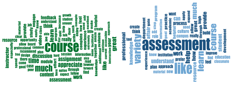
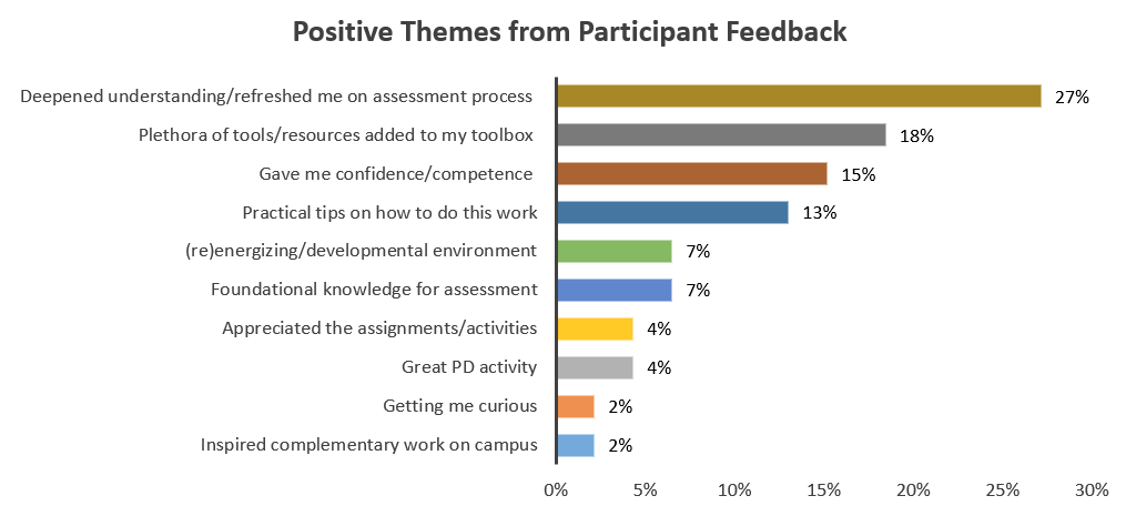
When looking at the user experience survey, the majority (62%) of comments were positive, with 25% comments as suggestions for improvement and 12% comments of a negative sentiment. Below is a summary of the positive feedback:
Thinking through the suggestions for improvements, as well as the negative feedback, the instructors will reflect on ways to address the following as possible course changes in 2023:
- Contextualize module 3/assessment consulting as it can be intimidating so early in the course
- Consider content tracks for people engaging in assessment vs those leading assessment
- Consider requiring discussion board interactions
- Add more content in module 6; existing information felt rushed
- Incorporate more practical application/case studies beyond reflection in discussion boards
- Offer more live sessions; perhaps sessions dedicated to working through case studies
- Promote live sessions and resources early and often to participants
It is exciting to see we did not receive negative or constructive feedback this year about dated content, broken links, too much text, or lacking depth in course content (themes from last year). Seems our course improvements in the off-season helped resolve those issues. We still have some concerns or suggestions for improvement similar to last year (e.g., more live discussions, meaningful discussion boards, keep integrating universal design components).
All of this information is useful as direction, guidance, and direct feedback for what is working well, what to improve, and what participants are looking for with respect to experience in the course. The course instructors take these data very seriously and work to have the participant voice reflected in the many improvements and enhancements made to the course.
Blog written by Joe Levy, SAAL Open Course Manager and Instructor
Email me at joedlevy@gmail.com if you have questions or comments about the data, or interest being involved with future open course efforts.